
Title
Taste of Home
Category
Visual Identity System
Taste of Home is a popular American media brand specializing in home cooking, comfort food, and family-friendly recipes. It is best known for its magazine, cookbooks, and website, which feature approachable, tested recipes and cooking tips from readers across the country. Since home can mean different places to different people, through this rebrand, I aimed to forge a connection between individuals and their heritage by offering a diverse range of culturally rich culinary recipes and related content.
Concept
Highlights
I restructured and simplified the existing system by incorporating four distinct symbols to appeal to a broader audience. Utilizing a refined color palette and brand textures, I sought to modernize the brand's aesthetic while simultaneously evoking a sense of comfort and nostalgia.
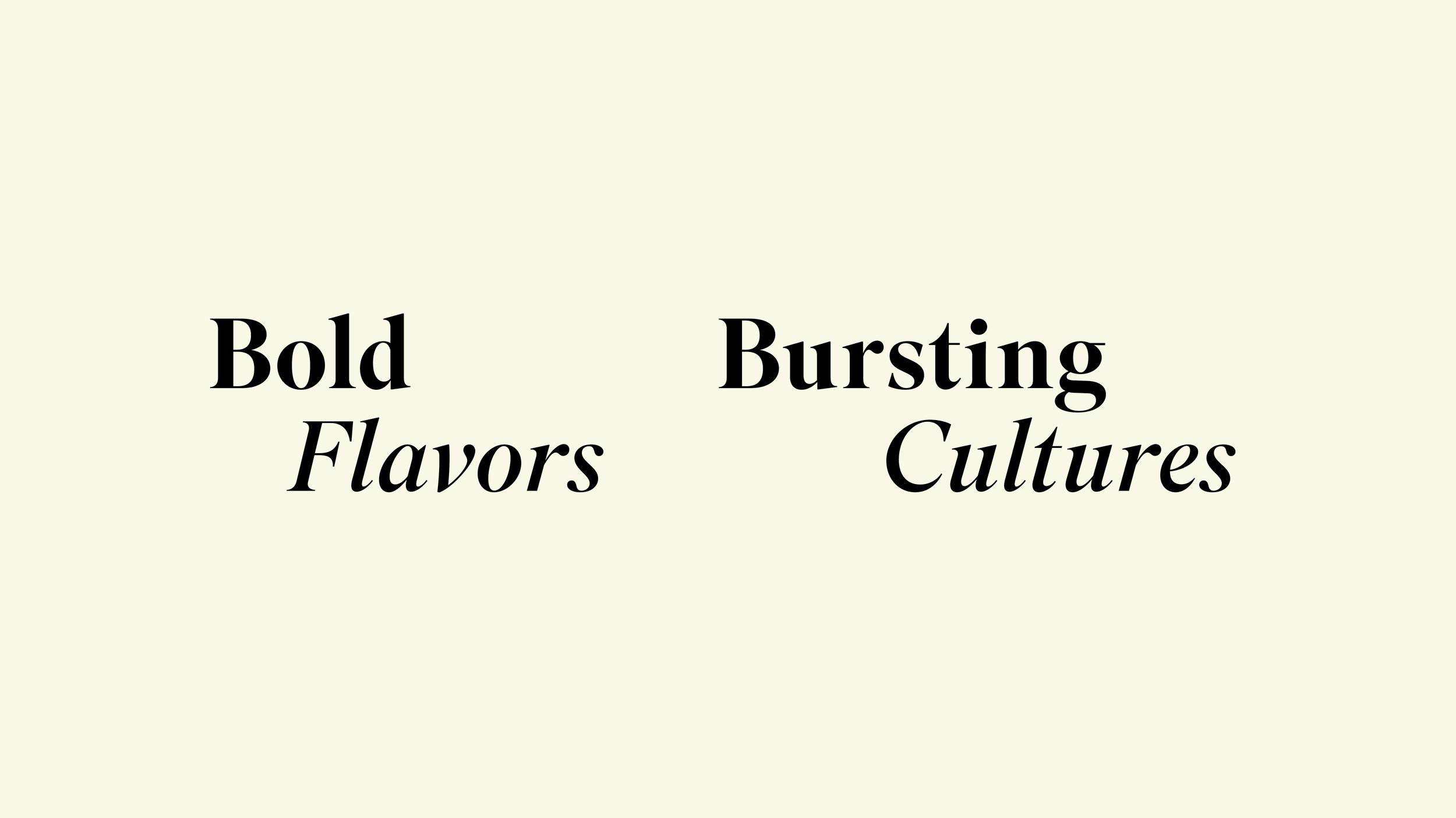
The tagline encapsulates the essence of Taste of Home by emphasizing that home signifies culture, and one of the most powerful reminders of culture is the distinct flavor and ingredients of its food.
Tagline
The logo development was inspired by the intricate shapes of herbs and spices, which are integral to a culture's identity, as they define the authentic taste of its food.
Logo Development

I chose Superior Title for its boldness and sharpness, which complement the logo. The combination of a serif typeface for the headings and a simpler sans serif creates a balance between classic elegance and modern simplicity.
Typography

I used vibrant and warm color palette to make the brand feel fresh, contemporary, and inviting.
Color Palette

The graphic elements consist of geometric shapes derived from the logo, as well as simple geometric icons and patterns inspired by these icons.
Graphic Elements


For the first and second identity poster sets, I focused on introducing the four main symbols: the leaf, representing ingredients and recipe-related content; the bowl, representing kitchen elevation content; the circle, representing cooking techniques content; and the square, representing meal plan content. The third and fourth identity poster sets emphasize the diversity of cultural foods that the brand will encompass.
Identity Posters

Each symbol and its corresponding pattern will represent the associated content, as illustrated in the content posters below.
Content Posters

Displaying the posters in urban landscapes around the neighborhood will inspire the audience to be bolder with their use of ingredients, while also reaching a more diverse audience.
Outdoor Mockups

I adapted these legends and systems to digital spaces to highlight key events, educational resources, and more specific contents.
Digital Spaces


